
Driving Global Growth at Spotify
Project overview
Increasing Spotify Subscribers by 250k annually through payment UX experimentation, focusing on emerging markets.
Role
Domain
Scope
The challenge
For years, Spotify’s purchase funnel was optimized for a single behavior: auto-renewing subscriptions via credit cards and PayPal. While efficient for established markets, this 'recurring-first' approach ignored a massive segment of our global audience. Our research indicated that 41% of Spotify’s Total Addressable Market (TAM) actually preferred manual, 'one-off' payments—using cash, e-wallets, or mobile credits.
Despite this huge demand, internal data revealed a stark reality: non-recurring transactions made up only 1% to 14% of total volume in key growth markets. This massive delta between our TAM and our actual conversion rates signaled a critical UX failure. My challenge was to move beyond the data and uncover exactly why these users were struggling to find—and fund—their Spotify experience.
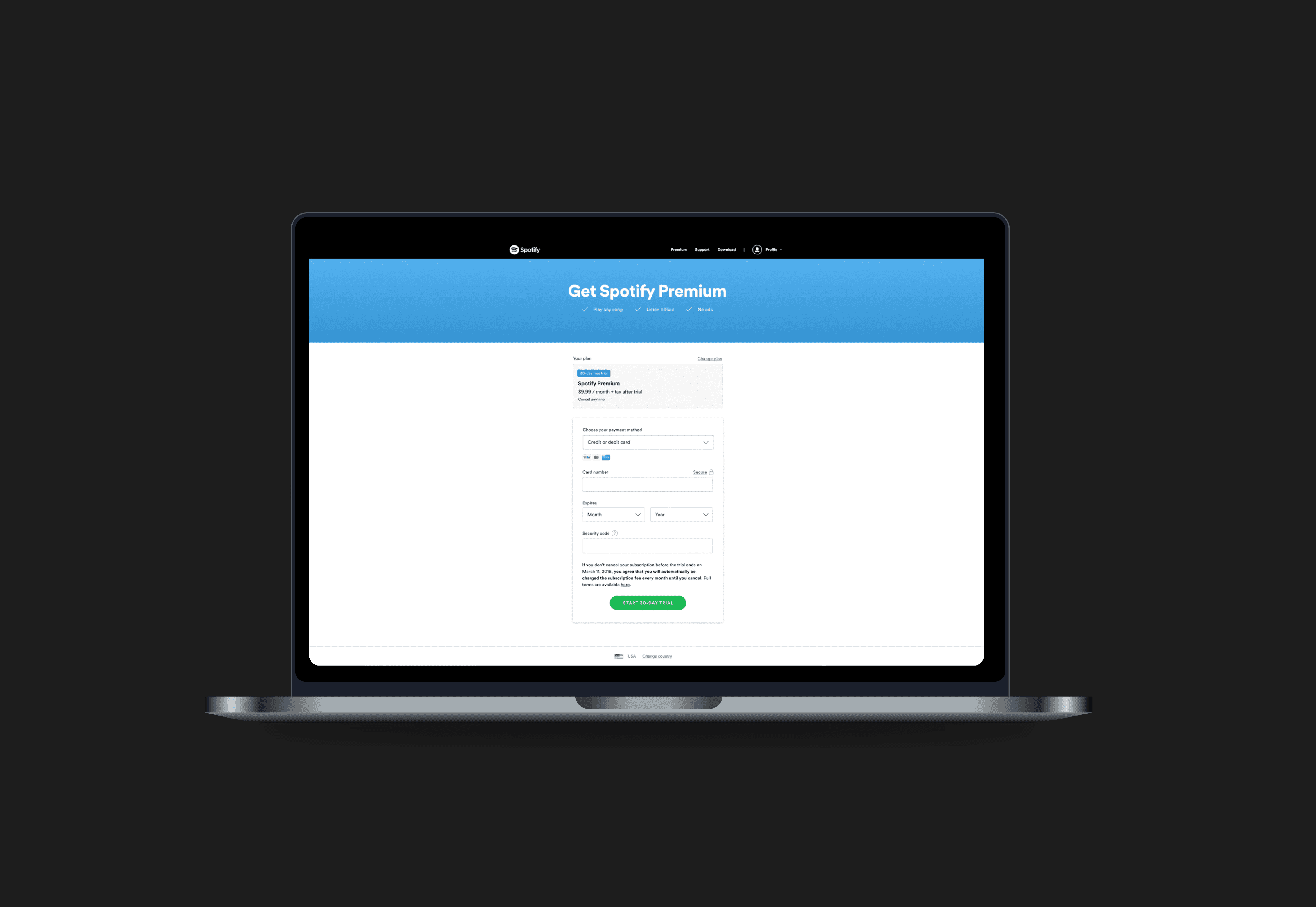
Current checkout design:
Research and Insights
Our abandonment surveys highlighted a clear hierarchy of friction. While 'high price' and 'payment declines' were significant blockers, the third most common reason—'Preferred payment method not available'—presented the most immediate opportunity for design-led growth.
Interestingly, deep-diving into this segment revealed a paradox: we actually did support many of the requested methods, such as Boleto in Brazil or Carrier Billing in Mexico. The issue wasn't a lack of capability; it was a failure of discovery. I identified two critical breakdowns in the user journey:
The UI Blindspot: Available payment methods were buried within collapsed dropdowns, making them effectively invisible to users scanning the page.
The Funnel Silo: Many users landed on a 'Recurring' plan by default, unaware that their preferred manual payment method was only available if they switched to a 'Prepaid' plan—a selection hidden several steps up-funnel.
Hypothesis & Ideation
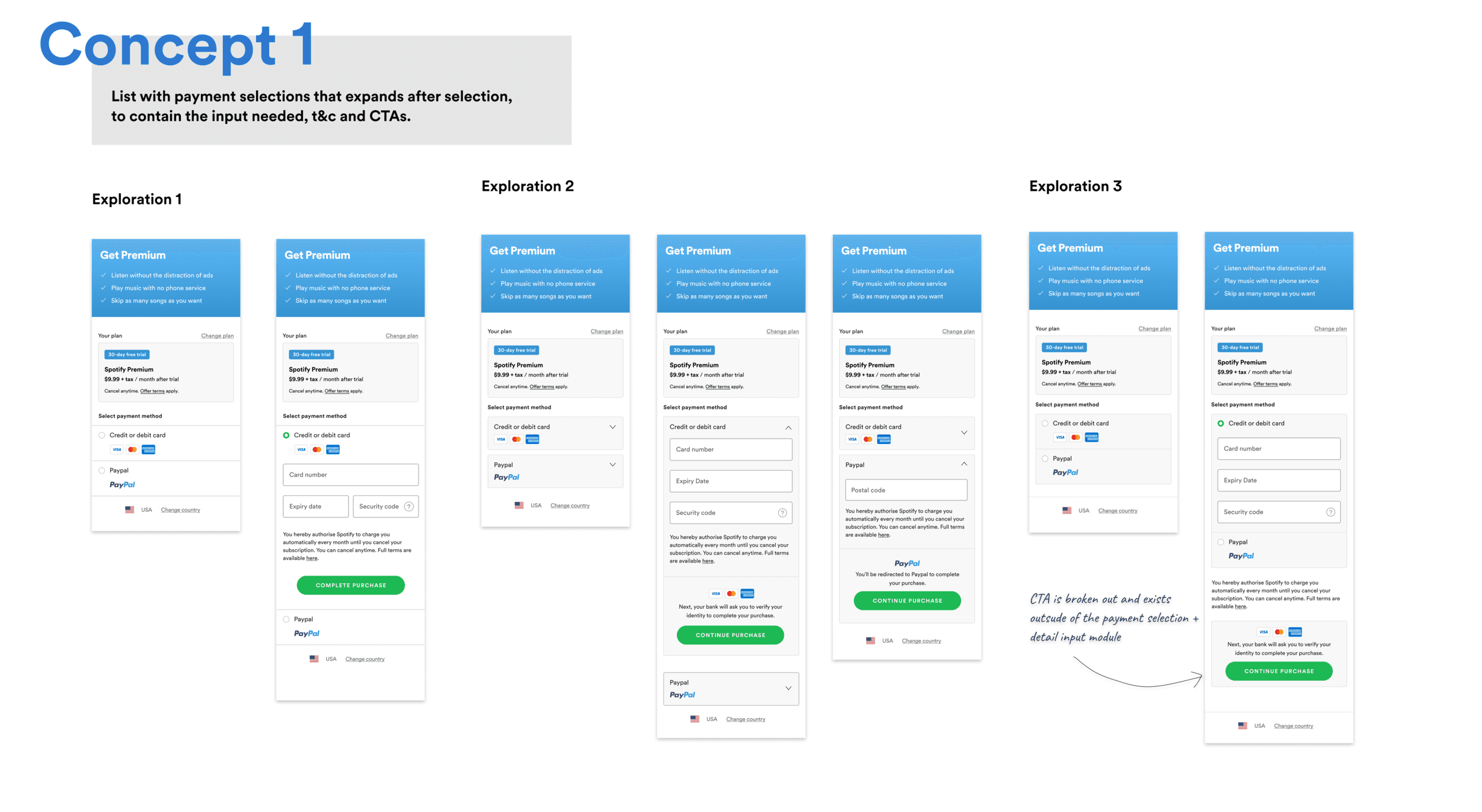
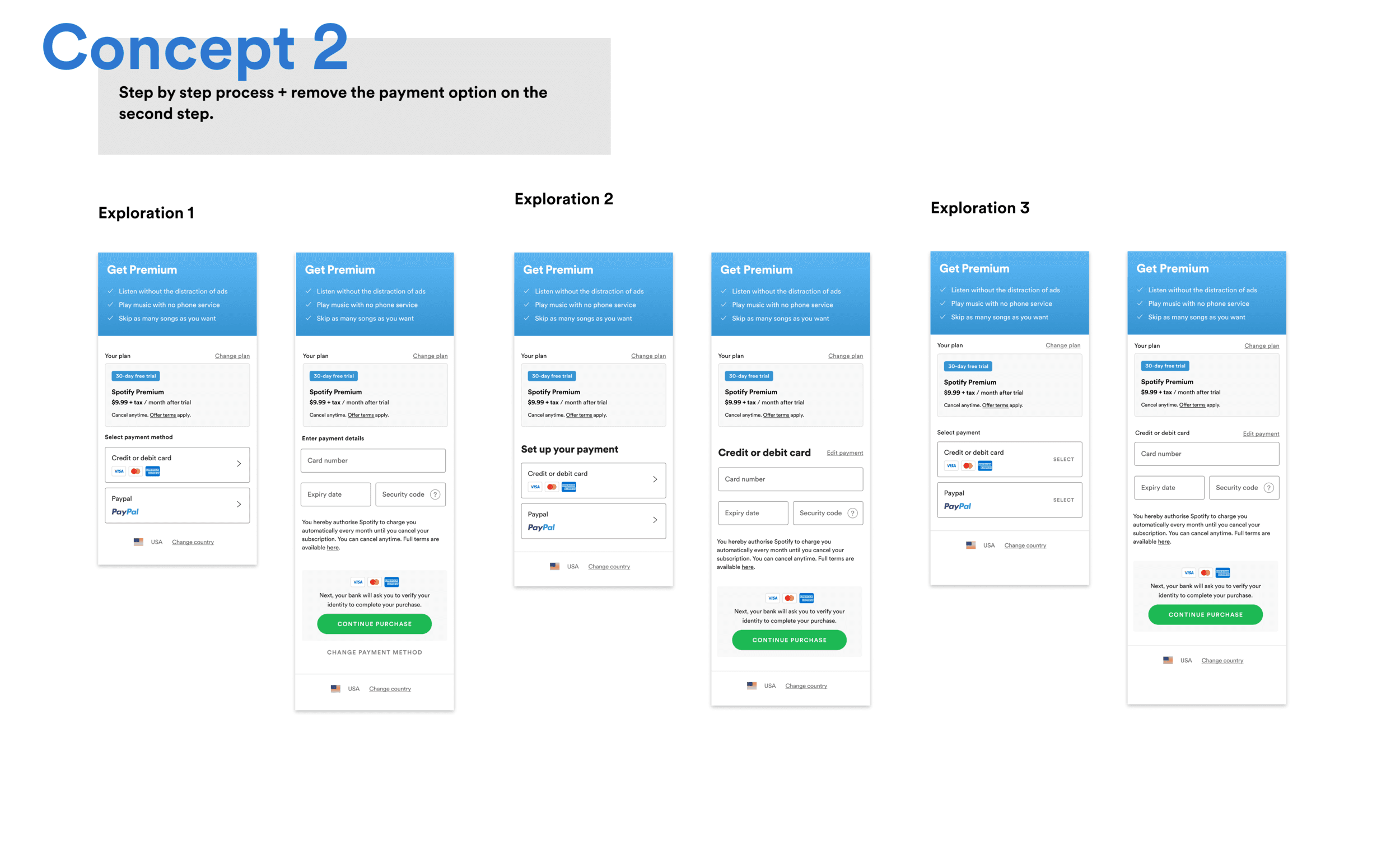
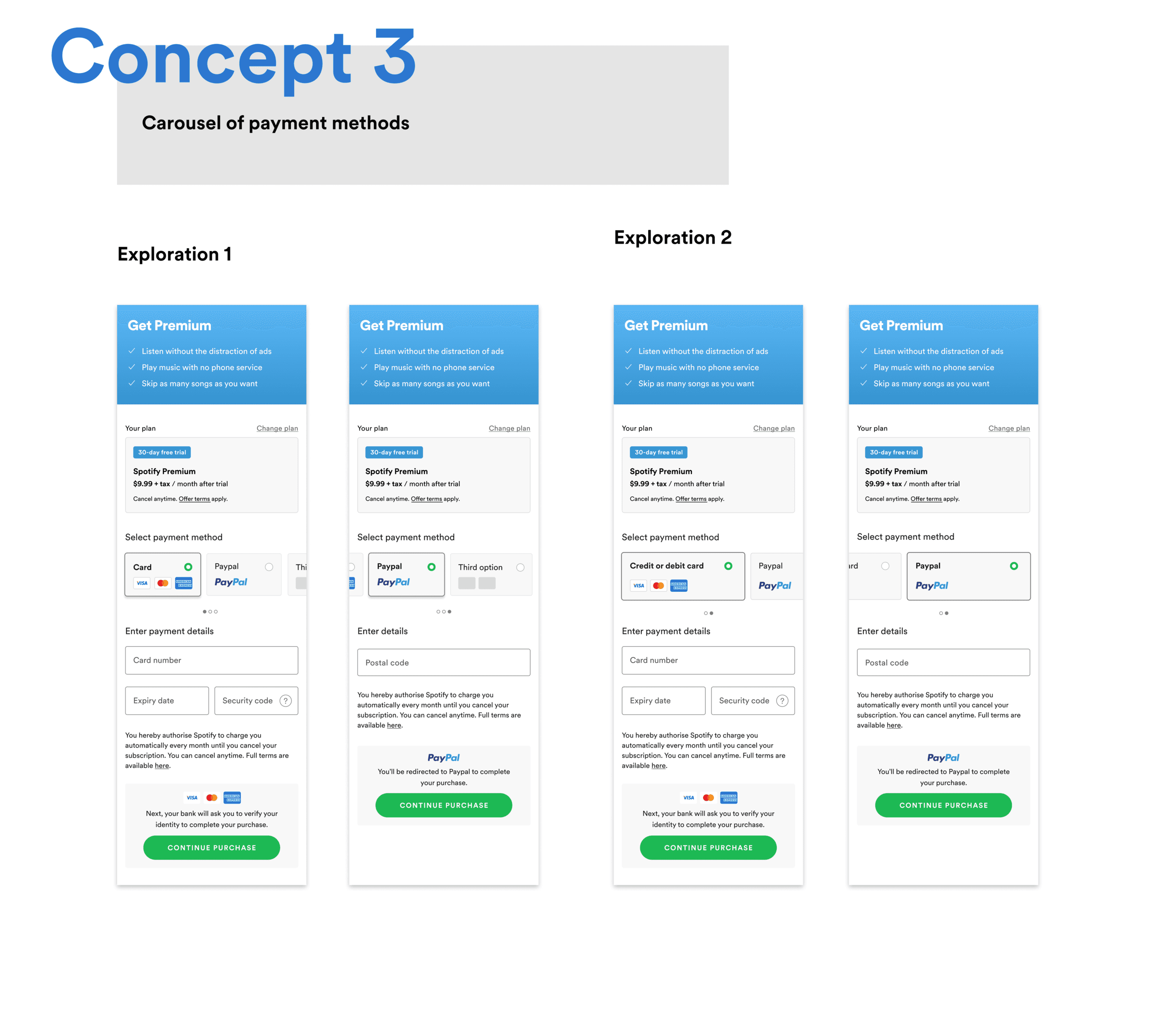
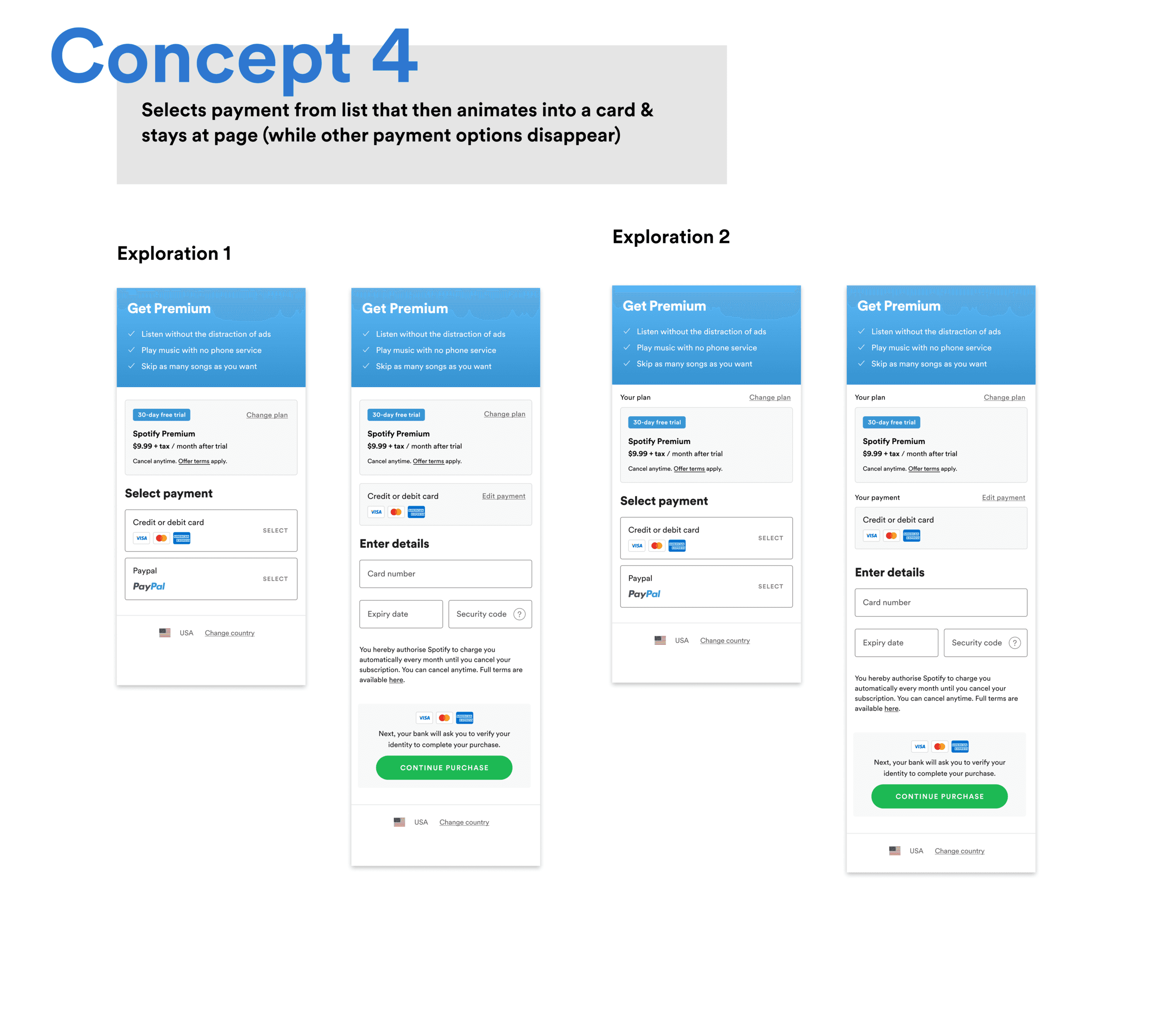
I synthesized our research into two core hypotheses, focusing specifically on the checkout real estate where our team had the most direct impact. My goal was to move from a 'messy' ideation phase—exploring everything from radical layout shifts to subtle micro-interactions—to a set of high-leverage concepts we could test immediately.
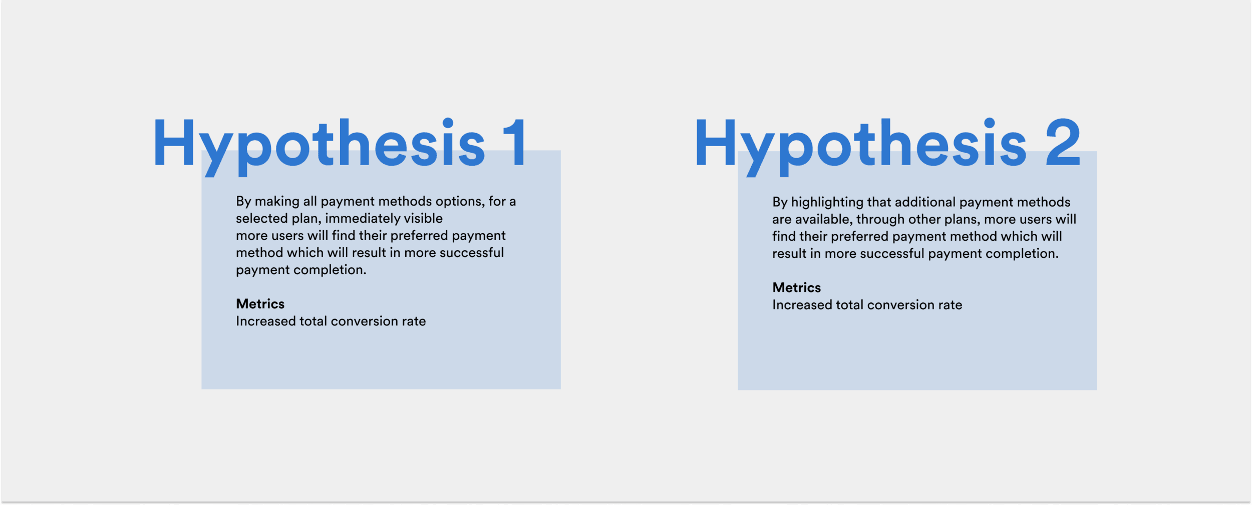
Hypothesis 1 (Visibility):
By making all payment methods options, for a selected plan, immediately visible more users will find their preferred payment method which will result in more successful payment completion.
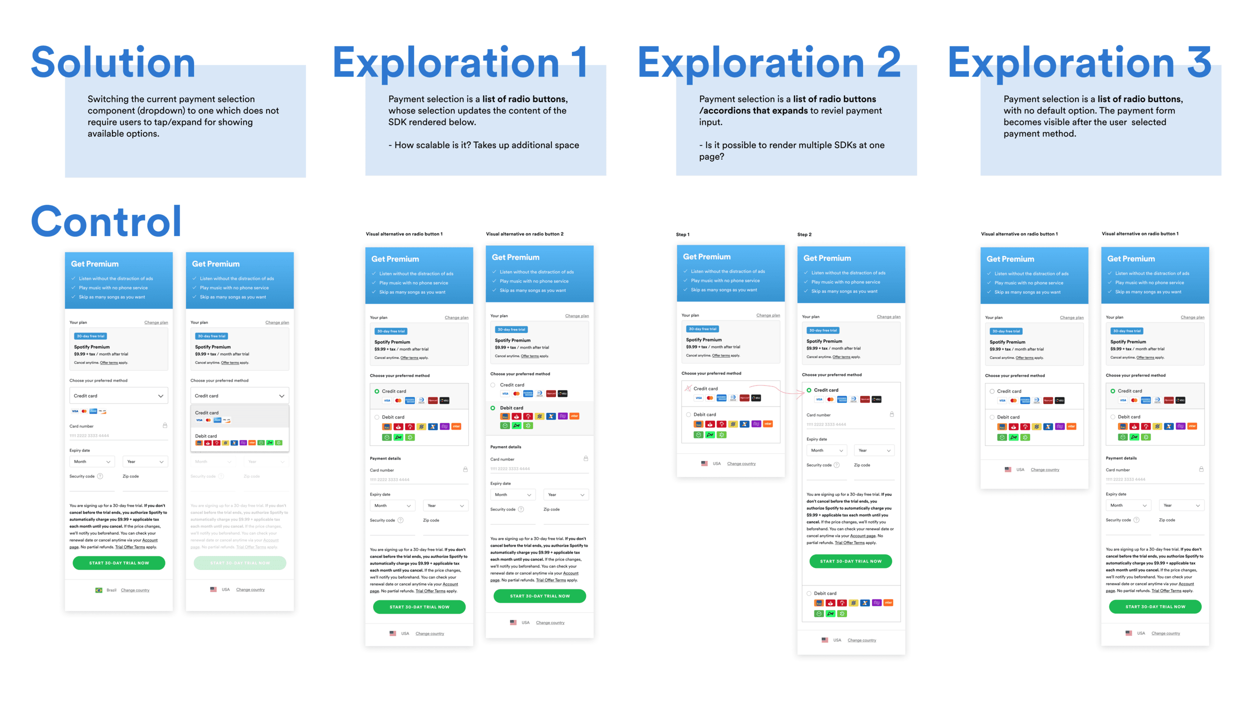
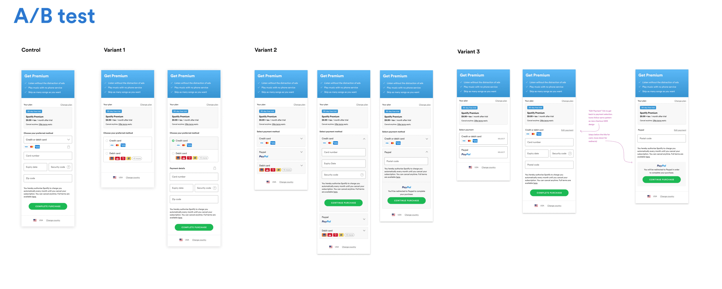
Solution: Switching the current payment selection component (dropdown) to one which does not require users to tap/expand for showing available options. See the different visual explorations below:
Hypothesis 2 (Awareness):
By highlighting that additional payment methods are available, through other plans, more users will find their preferred payment method which will result in more successful payment completion.
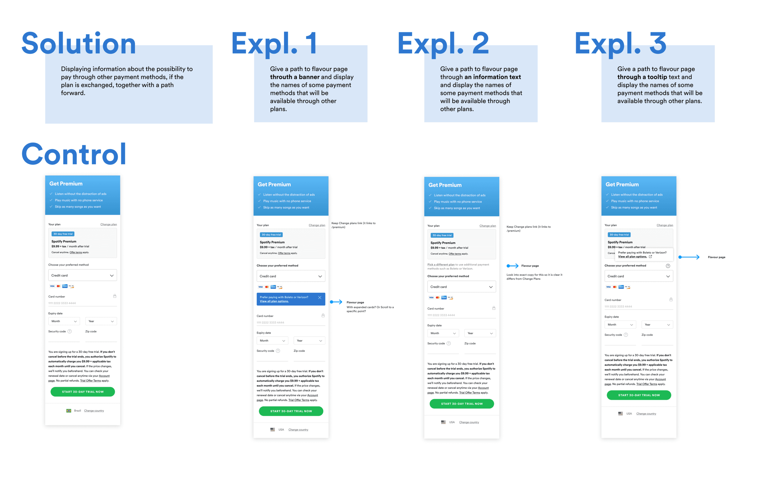
Solution: Displaying information about the possibility to pay through other payment methods, if the plan is exchanged, together with a path forward. See the different visual explorations below:
A/B Testing Round 1: Validating the direction
In our first round of experimentation, we focused on testing 'Visibility' (Hypothesis 1) vs. our control. Despite some technical constraints that forced us to prioritize specific variants, the results were definitive:
The Result: Every variant outperformed the control, delivering a 0.5% to 1.4% relative lift (up to 0.43pp).
The Pivot: While we attempted to test 'Awareness' (Hypothesis 2), data tracking issues forced us to pause. Recognizing the clear momentum behind 'Visibility,' I made the strategic decision to double down on refining that component while handing the broader 'plan-switching' problem to a partner team.
Iterative refinement
With a validated direction, I entered a second phase of deep iteration. I explored four distinct interaction concepts, focusing on balancing visual clarity with technical performance.
Working closely with engineering and product, we triaged our options based on 'real-world' performance:
Concept 3 (Abandoned): Dropped due to potential lag on slower mobile connections—a critical factor for our emerging market users.
Concept 4 (Postponed): Identified as a secondary extension of Concept 2; we chose to test the core behavior first to establish a cleaner baseline.
Ultimately, we aligned on a test that pitted our most refined 'Visibility' patterns against each other to find the ultimate global standard.
Final test:
Results and final solution
The data confirmed our core hypothesis: by prioritizing the discoverability of local payment methods, we directly unlocked a massive segment of previously 'lost' users. Our top-performing variant delivered a 1.1% increase in total conversion rate, outperforming the control across every market and device slice.
The business value of this high-visibility design was substantial: * Conversion Lift: A consistent 1.1% relative increase in successful completions. * Global Growth: This improvement was estimated to drive an additional 250,000 new subscribers annually.
These results proved that our 'Recurring-first' defaults were a barrier to entry. Following the successful global rollout, the project sparked a fundamental shift in our monetization strategy, leading to new workstreams dedicated to 'super-serving' the unique needs of non-recurring users worldwide.
Reflection
This project was a powerful reminder that at a global scale, 'minimalist' design can sometimes lead to 'exclusive' design. By defaulting to a clean, recurring-first UI, we were inadvertently creating a barrier for 41% of our potential market.
My key takeaway was the importance of triage in design. While we identified deeper issues up-funnel, the decision to focus on 'Visibility' allowed us to deliver massive business value (~250k subs) without waiting for a full platform rebuild.