

Originally published on Medium.
What design elements are actually differentiating Googles Material Design Guidelines from Apples Human Interface Guidelines? And even more interesting; what elements in the design languages are getting more and more similar? In this article I will look into this, focusing on the new updates in iOS 11.
To be able to point out the most essential differences/similarities and to show how I would use the guidelines to create new apps for the two platforms, I designed (read: threw together) two apps for this article, that I will use as examples. First, we just need to spend a few minutes talking about the differences that always have been there.
Navigation
As we all know, Material Design (left) has a few different options when it comes to navigation. You have most likely come across the hamburger menu revealing the navigation drawer: the menu sliding in from the left, and the tabs: straight below the page title. These are commonly used, but popular is also their bottom navigation: which is not used in my designs since the guidelines advice not to use them at the same time as tabs.
In Apples Human Interface Guidelines the famous bottom navigation setup called The tab bar is very popular. Even if it is restricting the designer to use an app hierarchy with three to five content categories it is quick, intuitive and well established since forever. The guidelines also provide alternative setups without the tab bar, which we can see in the the Notes app. So, even if Google also has bottom navigation alternatives this is probably where the two design languages still differ the most.

The top bar
(Called App Bar on Material Design and Navigation Bar in Apple’s HIG)
Here we have one of the big design updates for iOS 11, as you can see Apple is giving the navigation bar large, bold titles. This is for the standard view, and as soon you scroll down it shrinks back to the normal, smaller size. In addition, it can be worth to mention that this is not recommended for all pages, just where it can help the user and does not compete with the content itself, especially on top-level pages in apps using tabs.
I would argue that Googles App Bar is one of the flagship elements in Material Design. The hamburger menu, the colourful background and page title makes it easy to recognise as an android application. Even if the app bar is straight forward, allowing the specific application to brand itself through the background color, there is no doubt about that google is pushing hard on enforcing their own brand recognition inside the apps.
What is interesting here is that with the new iOS 11, Apple is also starting to push their brand a bit more into the apps. It is a stronger design language than before, sold as improving wayfinding in the app hierarchy — but obviously also increasing their brand recognition inside apps. Accessibility is important and has been a hot topic the last couple of years and it seems like iOS 11 takes advantage of this in a great way.
As you understand, this is an area where I see the two different design languages closing in on each other.
What about Tabs (Material Design) and Segment controls (Apple’s HIG)?
Another obvious difference, that is not new for iOS 11 is the extra functions that could be put inside the App Bar and Navigation Bar. Google use the classic Tabs for navigation while iOS has Segmented Controls to display different views . They are used very differently, so basically there is nothing new here.
Grouping content
Material design often uses cards in order to represent objects or group content together. Their guidelines are based on using qualities of objects in the physical world: objects or surfaces existing in a space together casting shadows and creating depth. Compare the two screens to the left with each other: it becomes very clear that Apple pushes hard on flat design, using shadows sparingly and rather relies on shift in background colours to group content.
But in contrast to this, cards do seem like a rising theme for iOS 11: using colourful pieces shaped like cards, with a casting shadow that creates more depth, as the right picture shows. Personally, I like it a lot — it fits well with their bold new titles, accessibility focus and it is definitely improving the visual hierarchy. However, this is also pushing the different design languages a bit more closer.

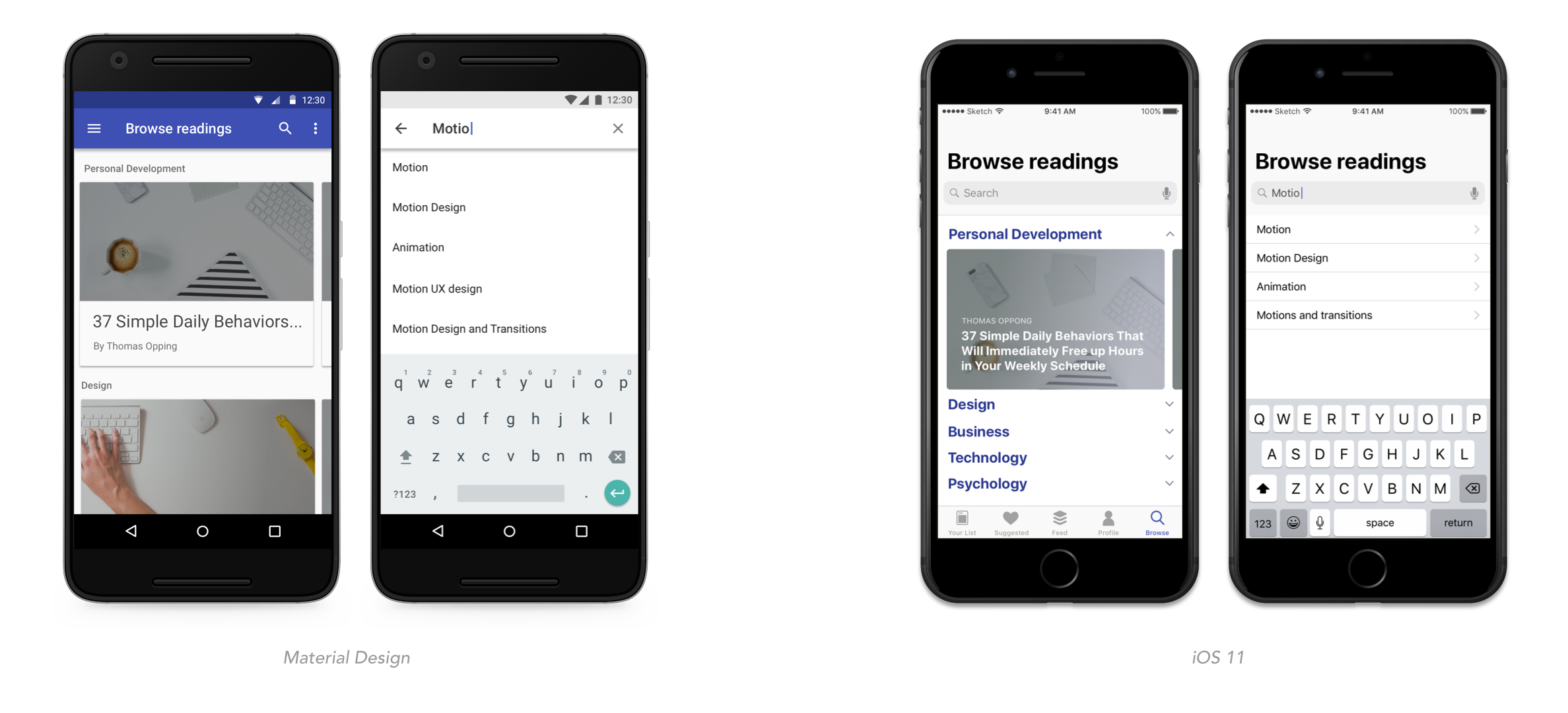
Sub headers and search
As the titles went bigger in iOS 11, so did also the subtitles. The two different patterns for search remain the same.
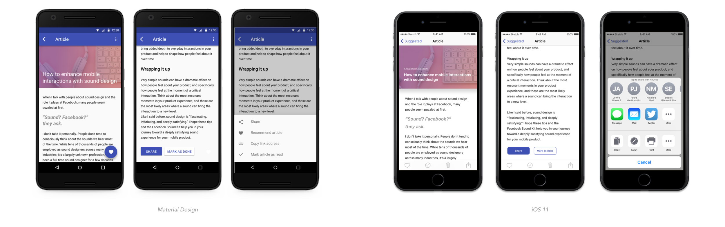
Buttons and toolbars
Finally, a few more of the well known differences. We all know that Material Design has its Floating Action Button, and that iOS has nothing similar. One option that presents similar functionality is the toolbar, taking the place of the tab bar in the bottom when we want to have the possibility to take a few actions on the content inside a current view. Below, you also see the different designs on buttons and action sheets.
The wrap up
Even though there are main patterns and elements that differentiate the two design languages, like the guidelines for navigation and hierarchy, there are clearly things bringing the two closer to each other. The most obvious similarity is the increased use of cards and shadows in iOS 11, moving away from the flat design and towards Material Design. Also, the great focus on accessibility feels more and more as a common denominator, which of course is both great and really important. In addition, i think the idea of pushing brand recognition into apps also are getting more adopted from both sides, even if this in practice means the design languages are getting more different.
If you want to read an even more in-depth and thorough comparison between iOS and Material, this is a great article I found.
Thanks for reading!