
A new checkout component for Spotify
Project overview
A new flexible reusable checkout component, with a new scalable fresh UI.
Role
Domain
Scope
Background
The checkout at Spotify is the engine behind selling all our recurring and non-recurring plans, triggered by web landing pages or in-app CTAs. It's where we are getting the majority of 💸 to run the business. Because our markets are so diverse, we support a broad spectrum of payment options, including e-wallets, carrier billing, and local cash-based methods. It’s also the same interface users interact with when they need to refresh their payment details in their account settings.
In the past, we had a bit of a legacy challenge. To help another internal team manage ad and campaign payments, a standalone payment page was built. This meant the checkout wasn't integrated; users were kicked out to a separate hosted page to enter their information before being redirected back to Spotify. As you can imagine, this out-of-flow experience wasn't ideal for conversion or trust. And it was definitely not future proof.
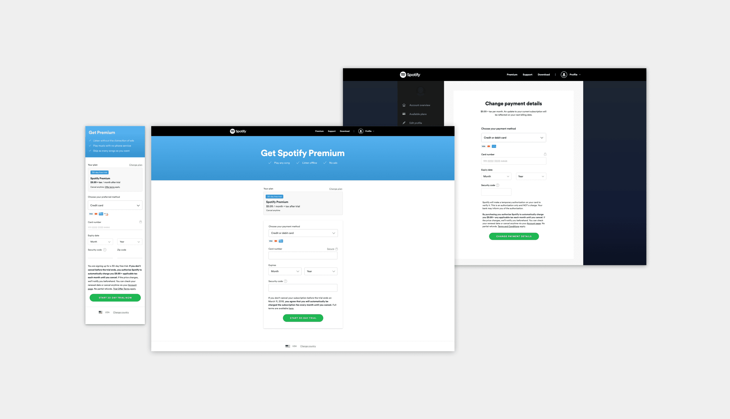
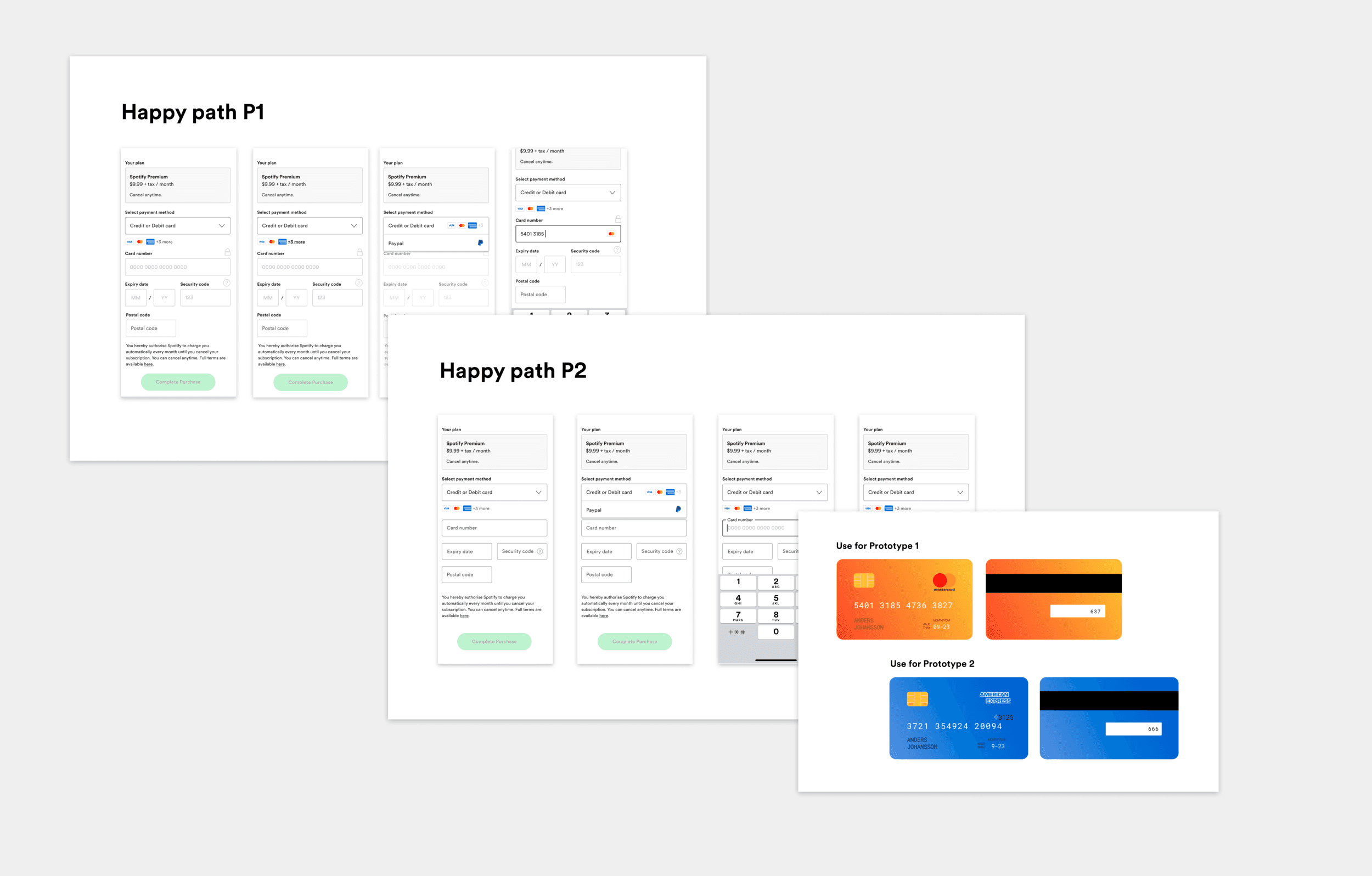
This is the design of the Checkout experience when I started to work on the project.
The challenge
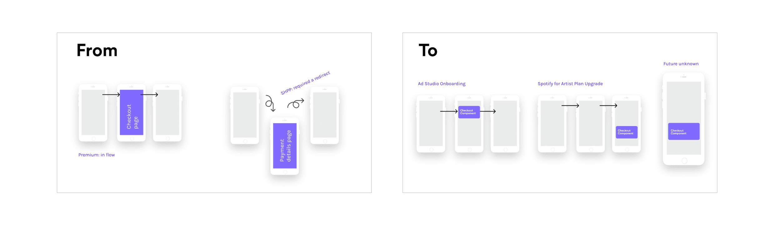
As the business grew, so did the demand for monetization. It felt like every team across the company suddenly needed payment features, and it became clear that building separate checkouts for everyone was a dead end. To solve this, we put together a strategy to empower all of Spotify with a single, seamless payment experience—allowing us to scale new opportunities fast without compromising on how users wanted to pay.
We decided to build one universal checkout powered by an embeddable React component. This meant a huge change for my design process. We shifted from owning the entire end-to-end page—where we controlled everything from product selections to layouts—to owning a single checkout component that could live anywhere. It had to be agnostic of the page it sat on, working perfectly regardless of the product flow or the available screen space.
Payment vision:
Users
We had to broaden our mindset to recognize that we had two distinct users: the end-customer and the internal Spotify teams using our tech. This forced us to evolve from being 'owners' of a single flow to becoming 'consultants' for the entire organization. We were building the infrastructure for Spotify’s global monetization strategy, not just a payment form. This shift completely redefined our design requirements, and the following sections dive into exactly how we tackled those challenges together.
Research and insights
With the goal of building a truly universal component, I needed to understand the friction points for both our end-users and our internal partners. I led a multi-pronged discovery phase: evaluating our current experience, synthesizing legacy research, and interviewing internal teams to understand their specific monetization constraints.
The insight was clear: we weren't just fixing UI bugs. We needed a system that was flexible enough for a dozen different product contexts while building deeper trust with users through better accessibility and clearer feedback loops.
The Audit: Prioritizing Friction
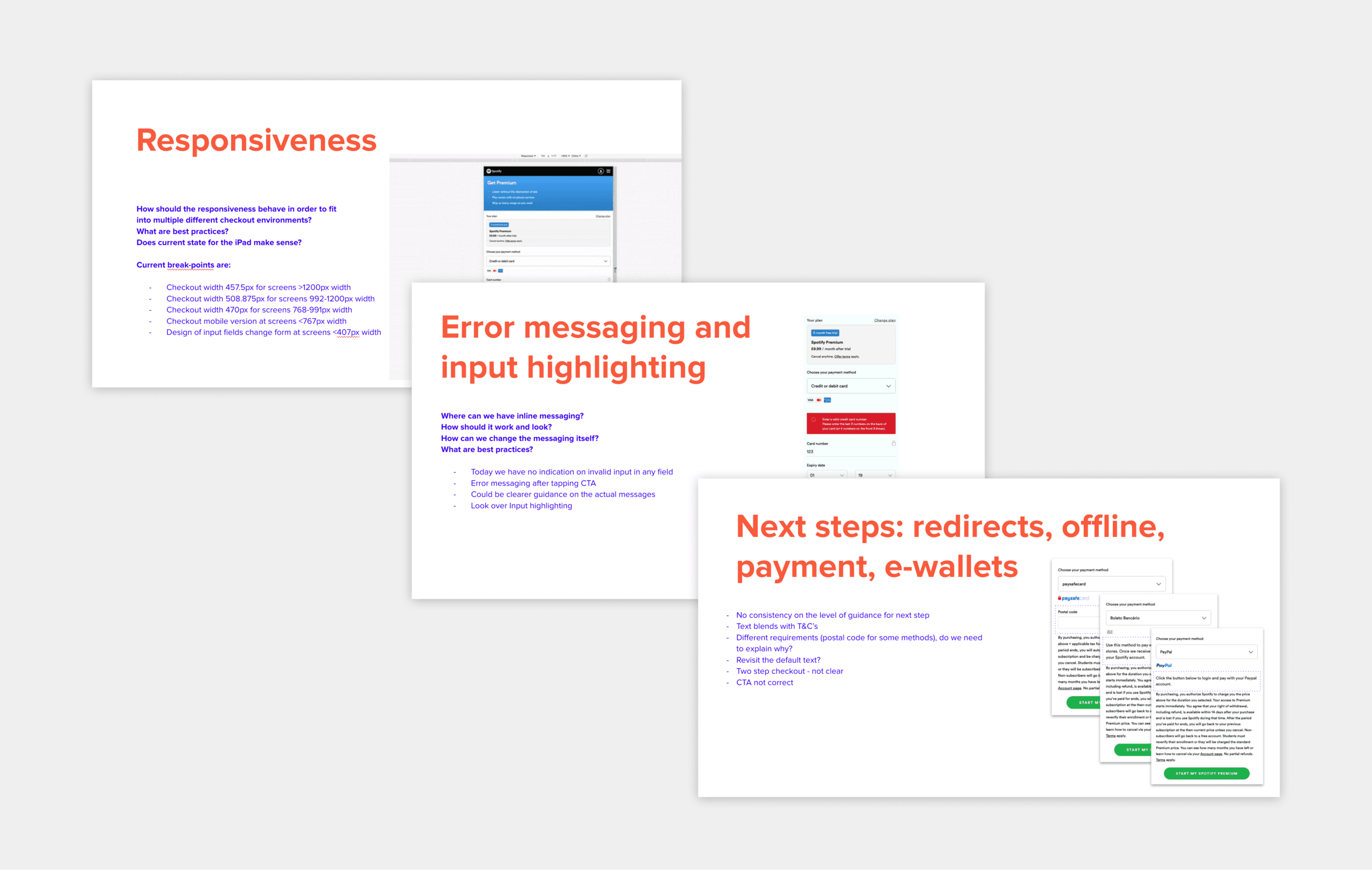
My expert evaluation of the legacy checkout highlighted several high-friction areas that were directly impacting conversion. Most of the UI didn't align with our current company design guidelines, and the responsiveness was brittle. We prioritized a few key "must-fix" areas for the new SDK:
Accessibility & Inputs: Moving away from non-standard, legacy input fields to a WCAG-compliant system.
Intelligence in Errors: Shifting from vague page-level messages to real-time, inline validation.
The Scalability of Choice: Questioning if dropdowns were the right way to surface an ever-growing list of local payment methods and rethinking how we handle complex "off-platform" redirects for e-wallets.
The image shows a screenshots from some of the pages in the Evaluation summary.
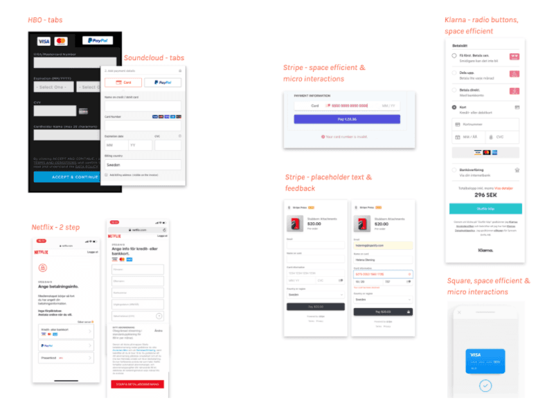
Landscape Review: Tech vs. Fintech
I looked at how other leaders were handling modular payments and found a distinct divide. General tech companies leaned toward simplicity (often using tabs), but they lacked the proactive guidance users need during high-stress financial moments.
On the other hand, "payment-first" companies excelled at high-performance UI: compact, space-efficient designs with fast feedback and micro-interactions that signal progress. My goal was to bridge these two—bringing that high-performance "fintech" precision into the Spotify ecosystem so that the checkout felt both native and incredibly reliable.
Defining success
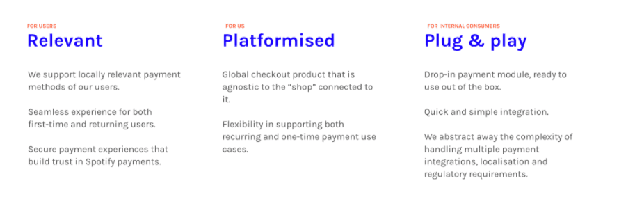
To keep the team aligned, I defined success across two parallel tracks:
1. For the End-User: Confidence & Completion We aimed for 100% form completion and zero "observed confusion" during qualitative testing. It wasn't enough for the payment to just work; the user had to feel confident while entering their details. We also set a hard requirement that conversion must be maintained or increased compared to our current high-performing control group.
2. For our Internal Consumers: Flexibility & Parity Success for our internal teams meant the SDK had to be a "plug-and-play" solution. It needed full functional parity with the old checkout but with a much more scalable pattern for adding new payment methods. We set a benchmark for at least two external teams to successfully implement the SDK as our initial proof of concept.
Ideation and Iteration
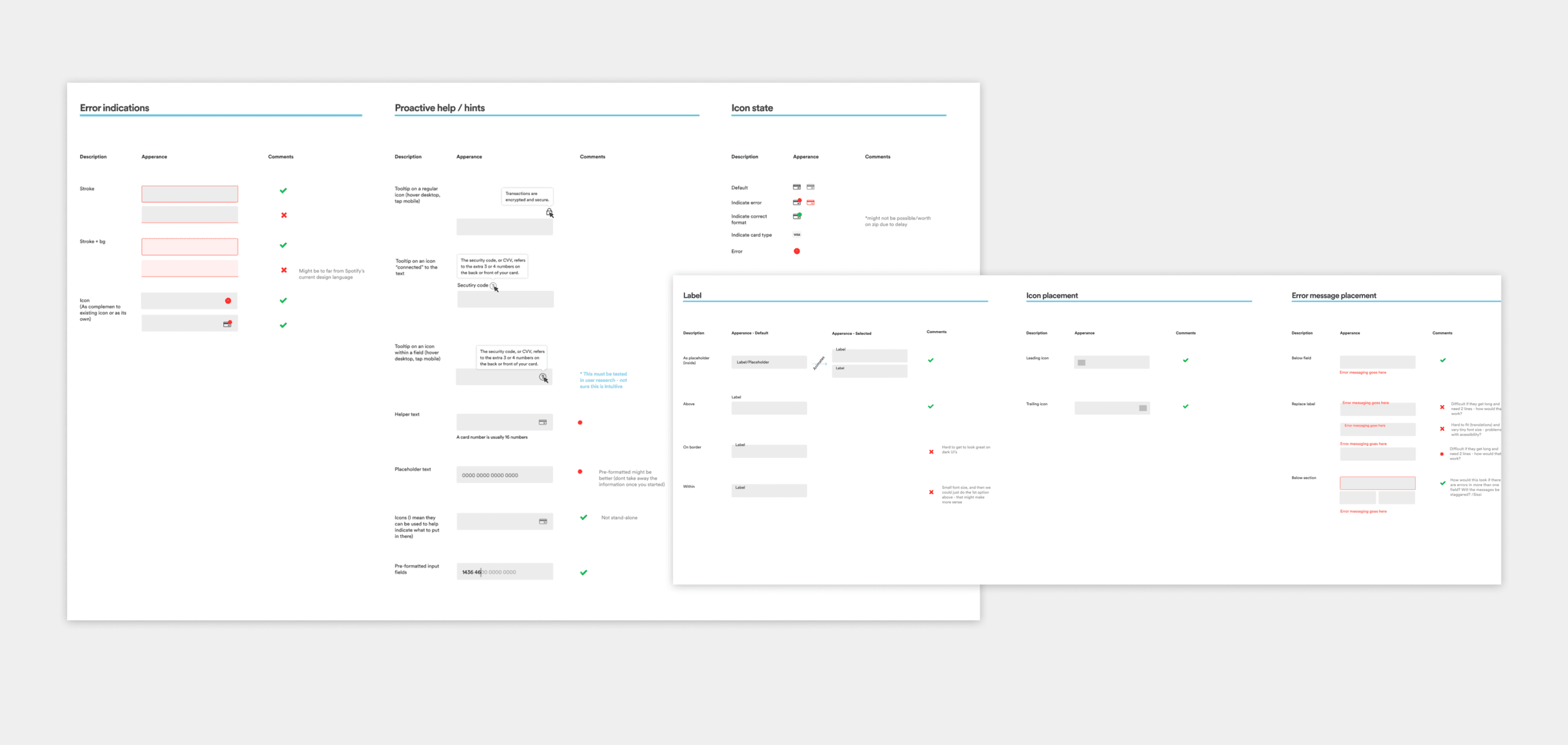
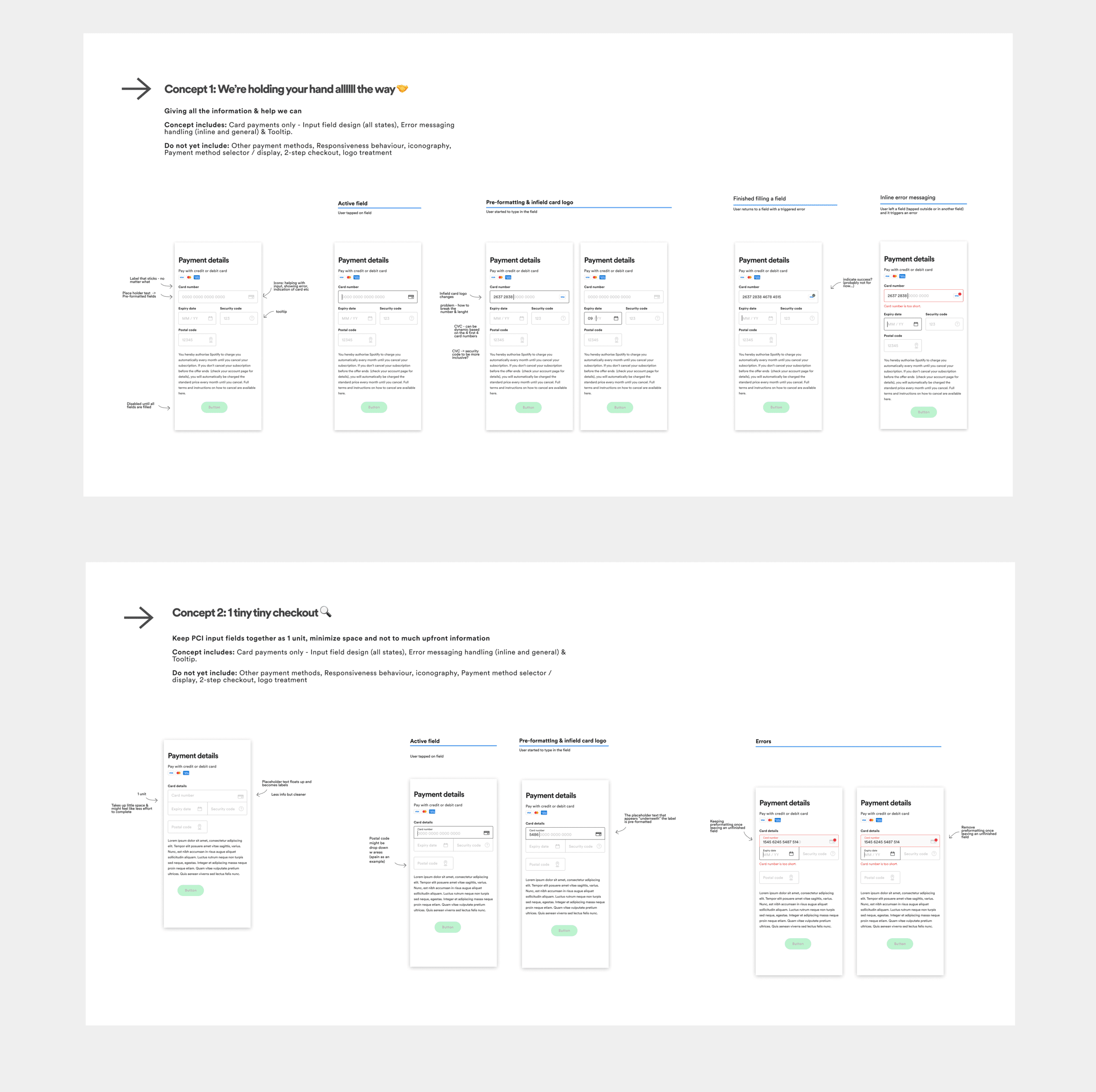
Ideation: Designing the Anatomy of a Component
I began by deconstructing the checkout into its atomic parts - looking at everything from label placement and input UI to the precise timing of error states. Because this was a universal SDK, every micro-decision had to be resilient enough to work in any layout.
I explored dozens of options, eventually bundling the most promising patterns into distinct concepts. These weren't just visual variations; they were different hypotheses on how to balance information density with user confidence.
Iterative Validation
To narrow down our direction, I led two rounds of qualitative usability testing in collaboration with our User Researcher.
Round 1: Form Ergonomics. We used high-fidelity Figma prototypes to test the the different form concepts - seeing how users reacted to different input styles and inline validation triggers.
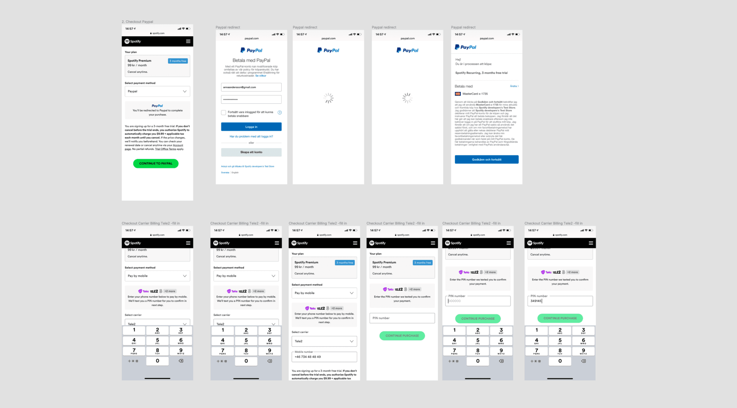
Round 2: Navigating the Redirect. We tackled the most complex part of the journey: multi-step payments and third-party redirects. We focused heavily on information hierarchy, ensuring users felt "held" and informed as they moved from Spotify to an external e-wallet or banking app.
These qualitative insights were crucial; they allowed us to strip away the noise and move into A/B testing with a highly refined set of variants.
Bridging Design and Engineering (QA)
As the SDK moved into development, I facilitated a collaborative QA process with our front-end team. Rather than just handing over a "perfect" file, I worked side-by-side with engineers to stress-test the implementation against my initial specs.
We focused on edge cases that often get lost in transition—like weird breakpoints and error-state transitions. This process was so effective in reducing "design debt" that we eventually standardized it as our team’s official Design-QA protocol for all future releases.
The Solution: A System for High-Performance Payments
The final SDK wasn’t just a visual refresh; it was a complete overhaul of our payment logic. I focused on four key pillars to ensure the component was resilient, accessible, and trustworthy.
Atomic Accessibility: We baked AA standards directly into the component. By standardizing larger tap areas and consistent focus states, we ensured that the checkout worked perfectly regardless of the device or the "real estate" it occupied.
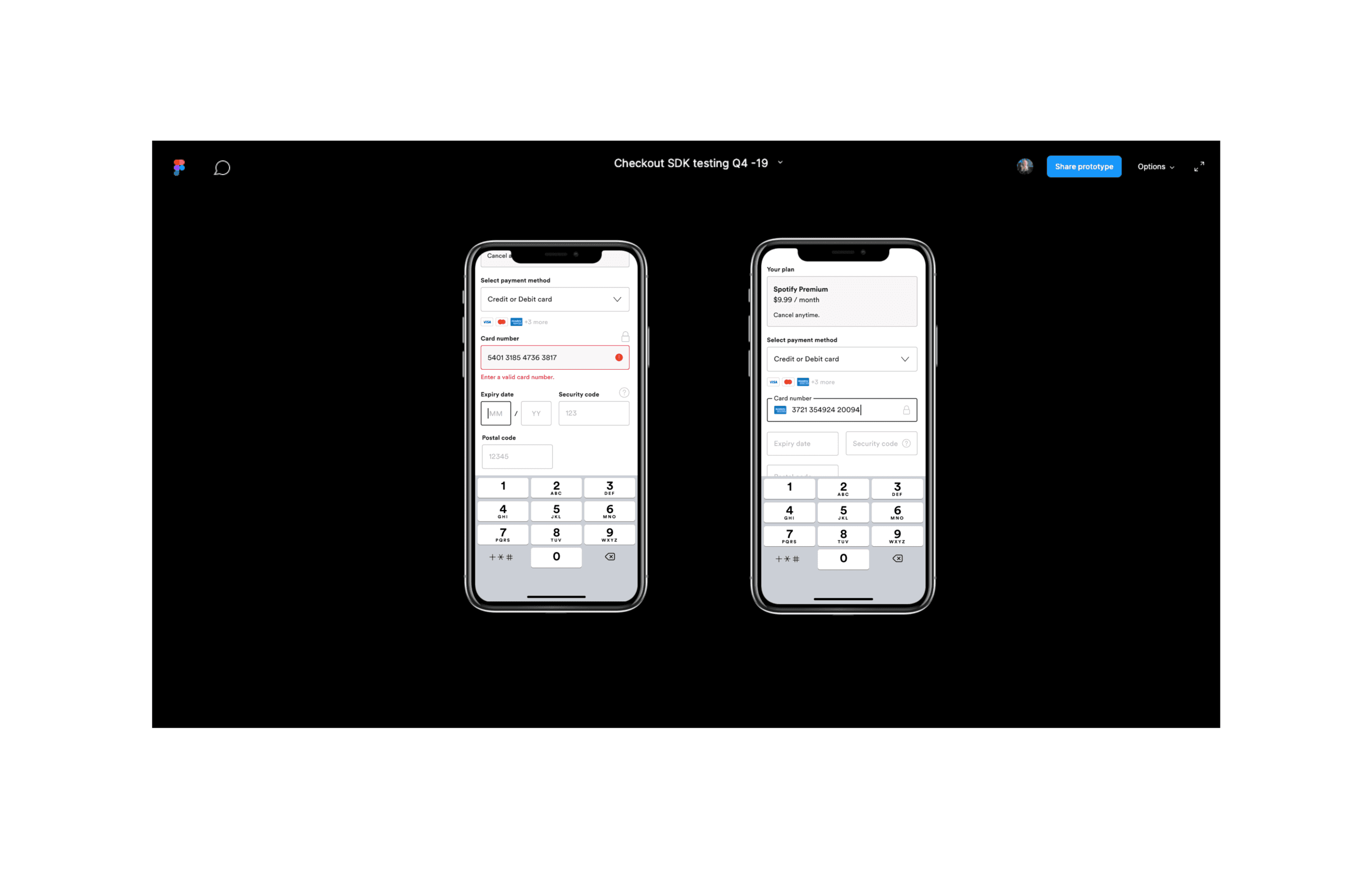
Intelligent Inputs & Proactive Guidance: Working closely with our Design System team, I designed a new input component that prioritizes space efficiency. We moved from "reactive" error messages (telling the user they failed after the fact) to "proactive" guidance—using auto-advancing fields, smart expiry inputs, and real-time inline validation to keep users in flow.
Managing Global Complexity: As our list of payment providers grew, the UI became cluttered. I implemented a scalable logo system that dynamically manages visibility, using a ‘show more’ pattern to keep the interface clean while still surfacing local payment methods.
Predicting the Redirect: For methods requiring third-party handoffs (like e-wallets), I redesigned the layout to clearly signal the coming transition. By setting expectations early, we reduced "redirect anxiety" and kept the user in control of the journey.
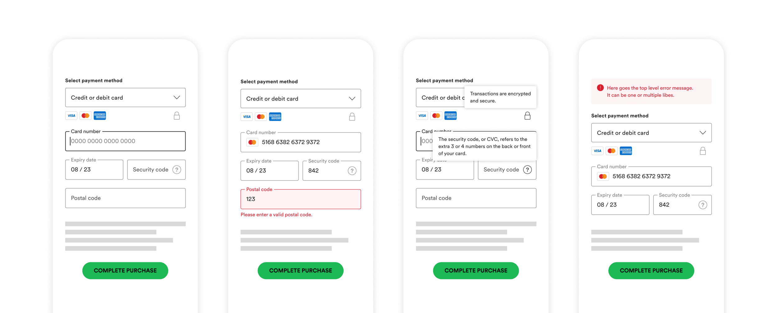
Accessibility, Error messaging and tooltip help.
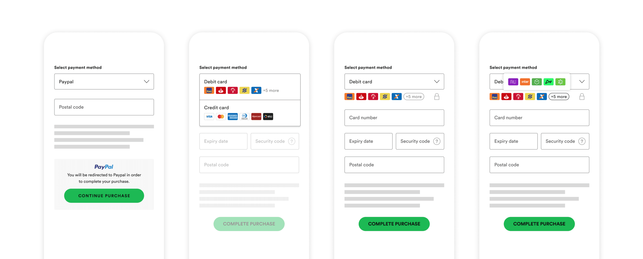
Redirects and logo treatment.
Validation: Protecting the Core Metric
Because we were replacing a high-performing legacy system, our primary goal for the A/B test was non-inferiority. We needed to prove that this new, modular architecture could support the business without hurting conversion. We split our testing into two phases to isolate the impact of our biggest changes.
Phase 1: The Input Engine
We first tested the new input fields and inline validation in isolation. Despite some initial technical hurdles, including a loading lag and a regional bug in LATAM, the new designs held steady against the control. This gave us the green light to move to the full-scale rollout.
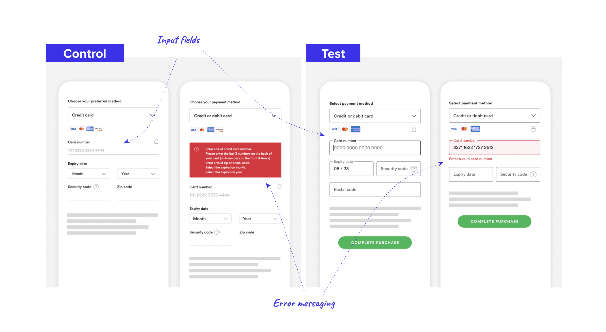
Phase 1: Control was tested against the new designs of input fields and error messaging (group 1 changes).
Phase 2: The Full SDK Experience
In the second phase, we tested the entire suite of updates. The results were clear: conversion remained stable (trending slightly up by 0.03pp), which was a significant win for a platform migration of this scale.
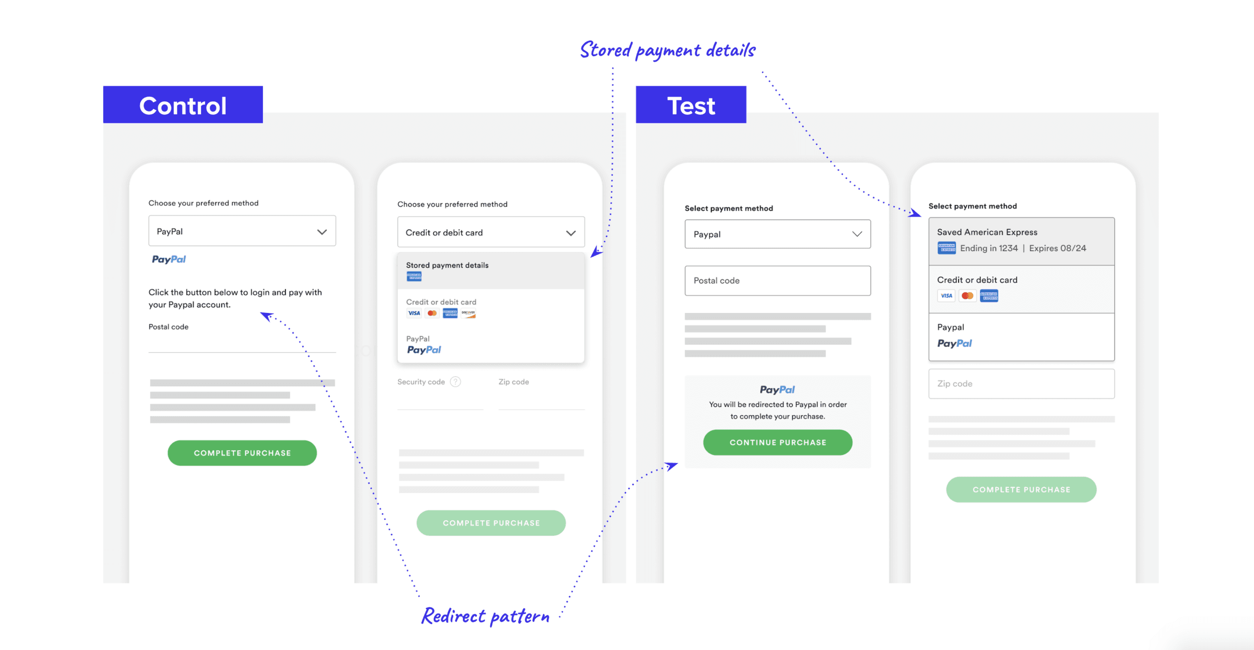
Phase 2: Control was tested against the entire new checkout design, including input fields, inline error messaging, redirect layout, new copy, pattern for logos, accessibility updates and visual updates to stored payment details, dropdown and more (group 1+2 design changes). Some of the changes are visualised in the image above.
Interestingly, we saw a slight drop in "intent rate" (clicks on the CTA), which was actually a positive signal. It meant our new inline validation was stopping users from submitting broken forms, leading to higher-quality attempts and fewer frustrating "hard errors" at the end of the funnel.
Rollout & Impact
With the metrics neutralized and the technical foundation proven, we proceeded with a global rollout. This project didn't just modernize the UI; it gave Spotify a scalable, accessible, and high-performance payment engine capable of supporting our next phase of global growth.
Next Steps
With the new Checkout SDK technology stack and design system stabilized, our focus shifted from platform migration to growth. While the initial scope was about rebuilding the engine, new survey insights surfaced a clear friction point we hadn't yet tackled: the payment picker.
Working in close collaboration with the R&D and business teams, I designed and launched a series of A/B tests to rethink how users discover and select their preferred payment methods. One specific variant delivered a 1.4% relative lift in conversion (0.43pp), a massive result for a high-traffic global funnel.
This discovery opened up an entirely new stream of work centered on payment method visibility and user psychology in emerging markets. I’ve documented that specific growth experiment in a separate case study, which you can explore here.